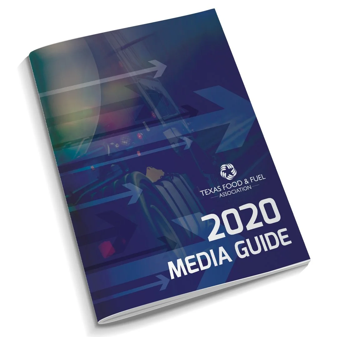
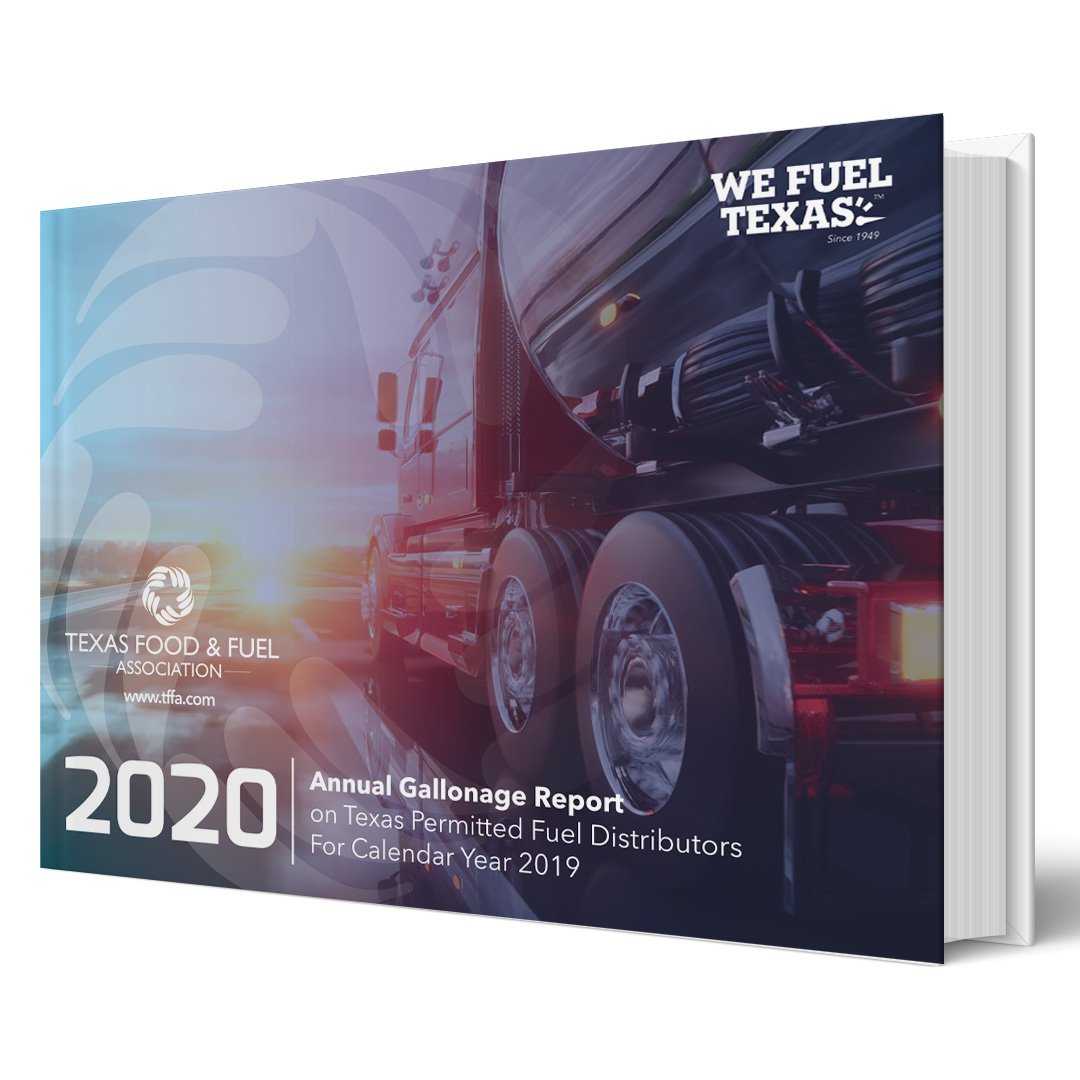
Branding & Identity


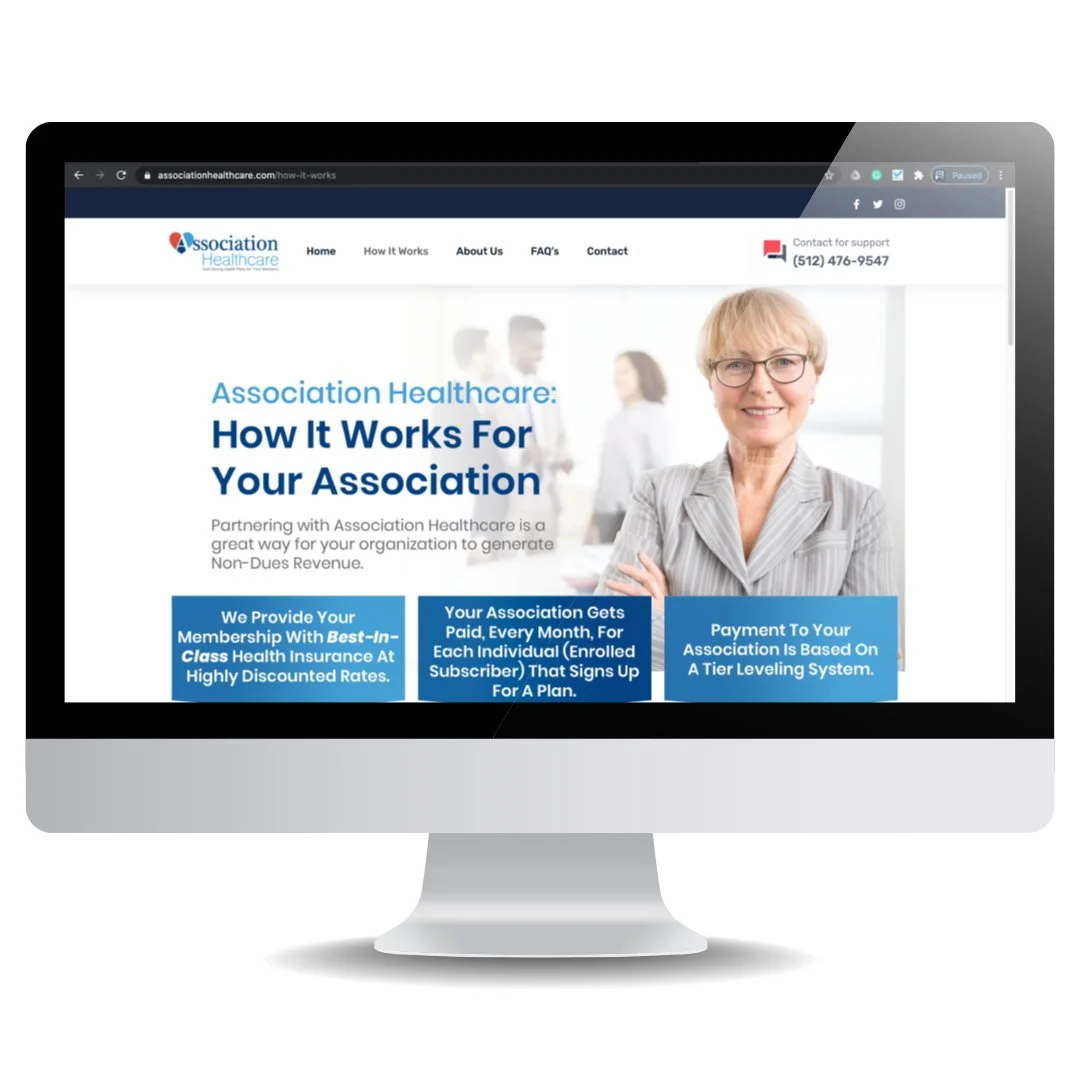
Association Healthcare
When the Texas Food & Fuel Association developed a new health insurance product for associations, I produced key pieces of its brand and marketing suite, including its logo, colours, website, print collateral, and social media marketing.
With the colours and fonts, I conveyed a sense of strength, modernity, and trust.
AANP National Conference
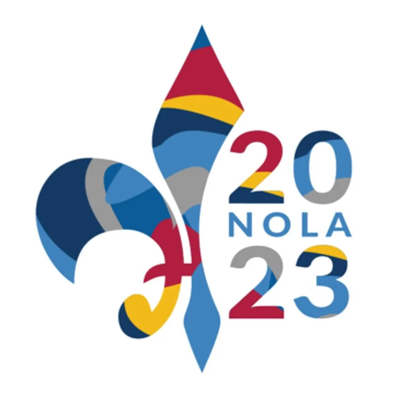
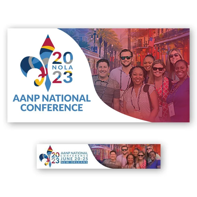
For AANP’s National Conference being held in New Orleans, I developed a logo that instantly said "New Orleans' while also being very on-brand for AANP. I centred the logo around a fleur-de-lis, which is emblematic of New Orleans. But instead of using typical NOLA/Mardi Gras colours of purple, gold, and green, I used AANP brand colours. To add to the creative's sense of fun, I arranged the colours in wavy, non-uniform shapes and sizes. The logo and type use six different AANP colours, giving it a vibrant and dynamic feel.
AANP is all about using images of actual NP members instead of stock photos, but I didn't have any member images from New Orleans. I did have some photos of members from an outing at a previous conference. I cropped the group out and composited them onto New Orleans street images, combining the French Quarter architecture with the NOLA tram, both of which are city landmarks.
I also produced a 120+-page conference guide, a brochure, and online banners.


TFFA Health Plans
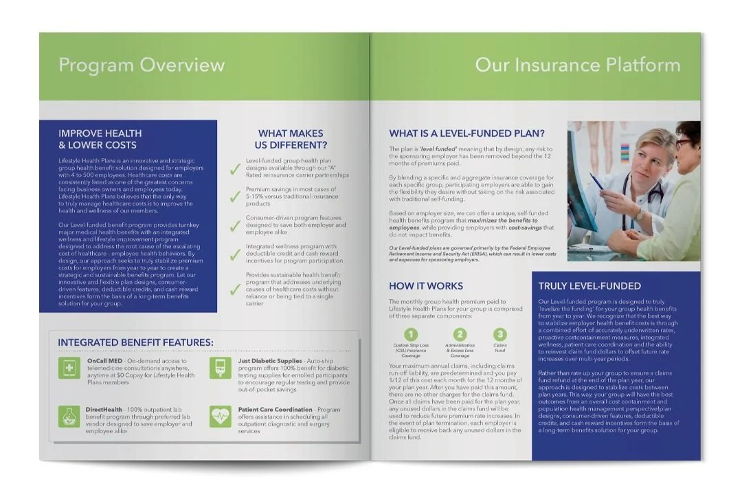
Another initiative by the Texas Food & Fuel Association was to sell health plans to its own members under its own branding. While Association Healthcare was a completely new initiative with distinct branding, TFFA Health Plans shared the branding of its parent health insurance platform. I modified the logo to incorporate the TFFA logo and produced collateral in this style.
Similar to Association Healthcare, my goal was to convey trust, modernity, and authority in an approachable way. I used stock images that depicted healthcare workers as professional, competent,
and friendly.

SW Fuel & Convenience Expo
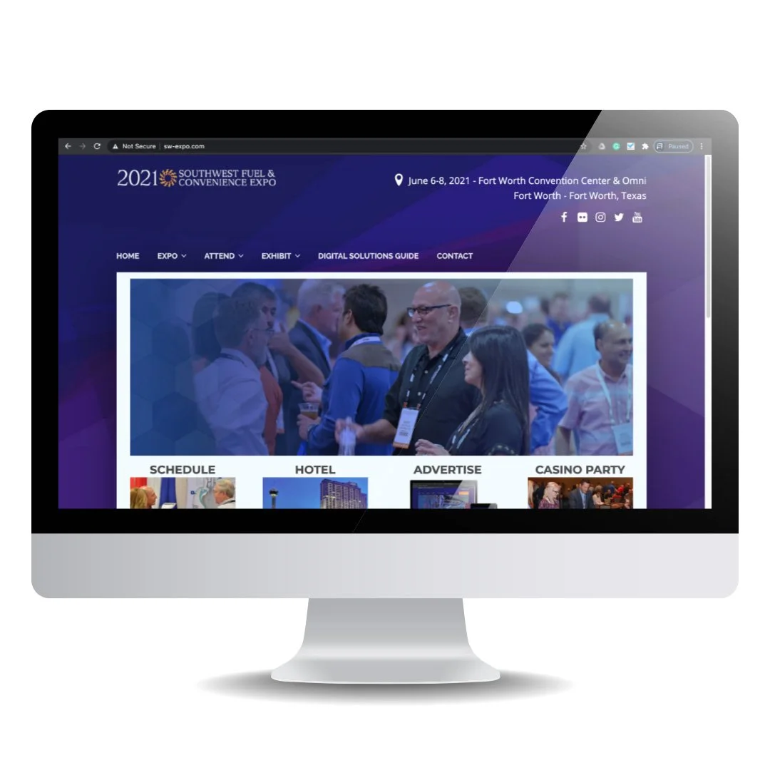
Designed and produced all marketing collateral for the SW Expo, including a new website. I also worked on the branding to create a more exciting feel while focusing attention on the three industries represented in the expo: convenience stores, fuel distribution, and retail business services. Each industry has its own pavilion on the expo floor.
For the backgrounds, I created a layered, faceted 'prism' design in the three pavilion colours, giving all the collateral a dynamic, colourful look. To promote and reinforce the new theme, I created a category icon for each pavilion in the style of road signs and used those throughout the collateral.
Food and drink represent convenience stores.
A fuel truck represents fuel distribution.
Credit cards and a cog represent retail business services.


TFFA ‘WE FUEL TEXAS’ Rebrand
Refocused branding around the Texas Food & Fuel Association’s slogan “We Fuel Texas” to bring attention to the association’s core focus: convenience stores and petrol stations, and petrol distribution and transportation, fueling both cars and people.